Konnect Insights Brand Guidelines

01
Overview

Hello! We’ve developed some guidelines to assist you in using our brand and assets, such as our logo, content, and trademarks, without necessitating the creation of legal arrangements for each usage.
If you plan to use our marks in a way that is not covered by these rules, please contact us at [email protected] and attach a visual mock-up of the intended usage.
02
Visual Style
Color Palette
#0A5A94
#111827
#FFC107
#F3F9FF
The color palette should be adhered to while talking about Konnect Insights.
Primary Color : The primary color represents the core identity of Konnect Insights. It is the dominant color used throughout the brand’s visual elements and should be prominently featured in the logo, website, and marketing materials. This color creates a strong and memorable impression.
Accent Colors: Accent colors complement the primary color and add depth and variety to the brand’s visual identity. These colors can be used to highlight important elements, such as headings.
Dark Color: The dark color is used for text or background elements that require high contrast against lighter backgrounds. This color ensures readability and legibility in various design contexts.
03
Typography
Primary Font
Aa
Poppins
Poppins
Poppins Medium
Poppins Bold
Poppins Extrabold
ABCDEFGHIJKLMNOPQRSTUVWXYZ
abcdefghijklmnopqrstuvwxyz
0123456789
Primary Font: The primary font for Konnect Insights is Poppins. Poppins is a modern and versatile font that reflects the brand’s contemporary and innovative identity. It should be used for social media posts, marketing collaterals, and any other offline materials. Specify the font family, font weights available, and any specific guidelines for usage (e.g., font size, line spacing, etc.).
Secondary Font
Aa
Inter
Inter Light
Inter Regular
Inter Medium
Inter Semibold
Inter Bold
Inter Extrabold
ABCDEFGHIJKLMNOPQRSTUVWXYZ
abcdefghijklmnopqrstuvwxyz
0123456789
Secondary Font : The secondary font for Konnect Insights is Inter. Inter is a clean and legible font that is optimized for digital use. It is specifically intended for web purposes, such as on the website, blog, and other online platforms. Specify the font family, font weights available, and any specific guidelines for usage. Provide examples of the secondary font in web-based contexts, including headings, paragraphs, and navigation elements.
04
Logos
Usage Guidelines
• The logo colors are shown as below.
• The logos should be used in such a way that the contrast is adequate for easy visibility.
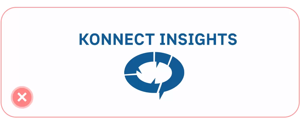
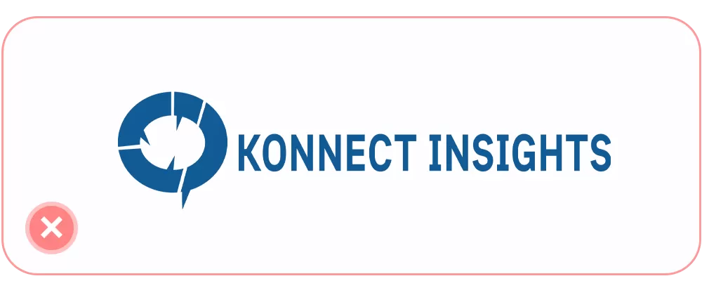
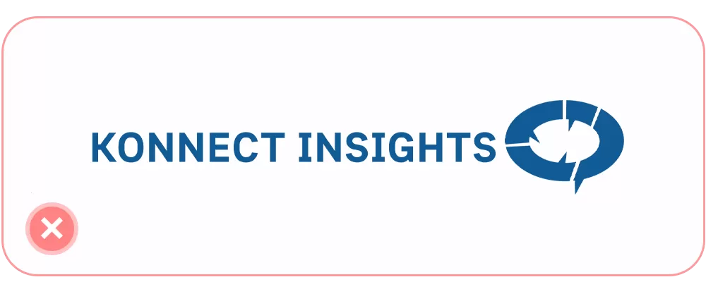
• The logo should not be morphed in any way.
• The color of the logo should no be changes there are 2 formats and 2 colors for the logo, only these are acceptable.
• Do not modify any aspect of the logo.
05
Things to Avoid
